Semantic Modeling Capabilities of Power BI, GoodData & Metabase: A Comparison
 Hiba Jamal,
Junior Data & AI Manager

Depending on your role, data modelling can mean different things.
For Data & Analytics Engineers
For some of us who have spent our fair share of time working with databases, the words data model illustrates a bunch of tables on a canvas. Behind those tables, we see discussions of whether or not they should be floating there by themselves or tied together by lines that say 1 or * on the corners.
If you are a data engineer, maybe you do a data vault model for ingestion, while if you are an analytics engineer you might do a dimensional model for supporting reporting requirements.
After figuring out what sort of entities, constraints, and relationships we need to define, we dive further into the data types of each of the fields within those entities. This makes the recipe for a good data model. This model is then implemented in the database, and deployed to be run against new data coming in. Lastly, to avoid the ill-fated incident of an analyst being lost in the complex structure and pipeline of the data, it must be documented!
For Data Analysts
For the dashboard creators, the initial data model has (hopefully) already been set up. A subset of the tables visualized by the engineers are to be handpicked and dropped onto a dashboard. Some tools do you the favor of detecting relationships between tables, if not, you can find a way to do it on the dashboarding tool itself. The data modelling for analysts includes building aggregated measures, calculated columns, semantic types definition to define the actions the tool allows on the field, and finding the best read, cache, and refresh options for the data.
If you have big data, the connected dashboards might be slow and need optimization. This is when you would be pushed to make the decision to fix the problem either before or after it reaches the dashboard. This means creating aggregated tables with a different data granularity, either in the source DB or in the tool cache db.
Introducing the three dashboarding tools
The three data reporting or dashboarding tools we’ll be diving into are Power BI, GoodData, and Metabase. All three have a substantial following among business intelligence teams and analytics experts, and the tools come with their own set of data modelling capabilities.
Introducing Power BI
Power BI is a powerful data visualization tool trusted by 97% of Fortune 500 companies by 2021. It's available as both desktop and online versions, but being a Microsoft product, it's limited to Windows. You can connect it to various data sources, including files like CSV and JSON, and databases like BigQuery and AWS Athena, and about 40 others! It offers a variety of visual elements for creating reports, and it also supports Python and R integration.
While its primary purpose is generating actionable reports for businesses, it's user-friendly for data exploration and modeling. It's affordable for BI analysts, with pricing ranging from free to $10-$20 per user per month, or premium bundles from $262.80 to $4,995 per month.
Introducing GoodData
GoodData prides itself as the #1 embedded analytics vendor, and currently in 2023, has 3.2 million end users worldwide. Established in 2008, it started with data exploration and visualization tools and has since evolved. In 2022, it introduced its cloud platform with enhanced features (the version referenced in this article). GoodData currently supports 10 data sources and 2 data source managers.
The user-friendly dashboard makes managing data, creating metrics, visuals, and dashboards quite clean and easy. Pricing varies based on the selected product, with both predefined and customizable options to suit an organization's needs.
Introducing Metabase
Metabase is a BI tool that is now about 4 years old, with a user base of almost 50,000 organizations that use it to work with their data. The tool has interesting terms to showcase its abilities to the “data democratization” crowd. For example, while loading visualizations or calculations, it tells you it’s: doing science ✨, which is a playful way to appeal to non-devs. Additionally, if you want to extract SQL-defined data from a source, Metabase calls it 'asking a question' to that source.
This tool serves as a foundation for embedded analytics and offers data organization through model creation and query building. With 26 official data source connectors, it also supports raw data imports. Metabase's pricing varies based on whether it's used as a managed service or self-managed. Self-management can include using it as an open-source tool, and otherwise it has pricing options that extend up to $500, along with custom pricing options.
The dataset we’ll be using for our experiments; modeled by dlt
Our database is based on the data published by LivWell, containing wellness indicators for women all around the world. It can also be found as a flattened CSV on Kaggle, here. It is a compilation of surveys collected from women internationally.
Sample input structure:
[{"survey_id": "AM2000DHS",
"country": "Armenia",
"marriage_related": [{...}, {...}, ...],
"work_related": [{...}, {...}, ...],
"education_related": [{...}, {...}, ...],
"money_related": [{...}, {...}, ...],
"health_related": [{...}, {...}, ...],
"age_related": [{...}, {...}, ...]
},
{...}, {...}, {...}, {...}]To break it up into proper tables representing the different sections of the surveys, we gave this data to dlt to unpack it into a flat relational structure into BigQuery. dlt automatically unpacked the original data into connected tables. The various child tables link to the parent table wellness using foreign keys. Wellness contains surveys identified by ID and country. The final setup of indicators broken up into different categories can be found below, as displayed by Power BI. This structured database has been used to experiment with all three dashboarding tools in this article.
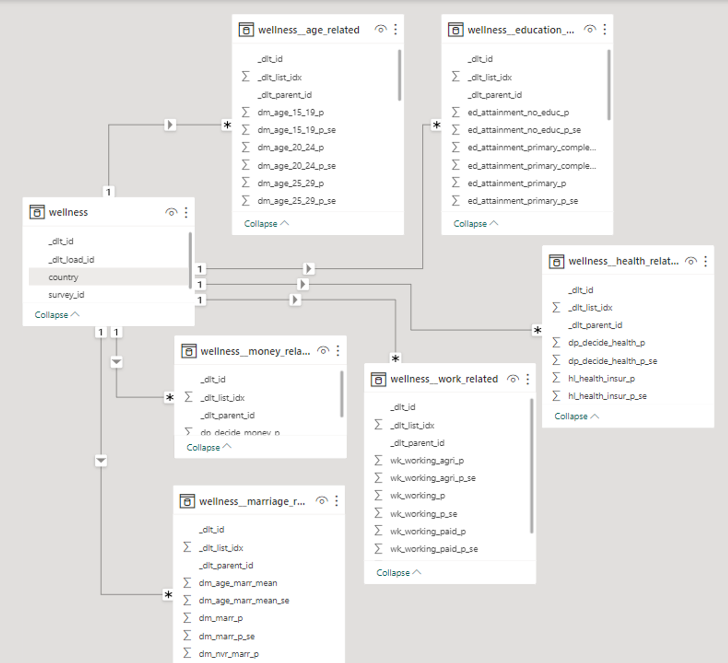
The database schema as presented by a Power BI Model.
Comparison Metrics & Table
The database hosted on BigQuery was loaded into all three dashboarding tools via their respective connectors. We came up with some metrics to compare things.
Before delving into detailed analyses of those metrics, here's an overview of what'll be discussed:
BIG TABLE
In-Depth Comparison
1. Data Types
When designing databases, or even coding in languages that require the “type” of a variable to be declared, we think of data types like int, float, double, char, varchar, string etc. The story becomes slightly different within dashboarding tools.
Power BI
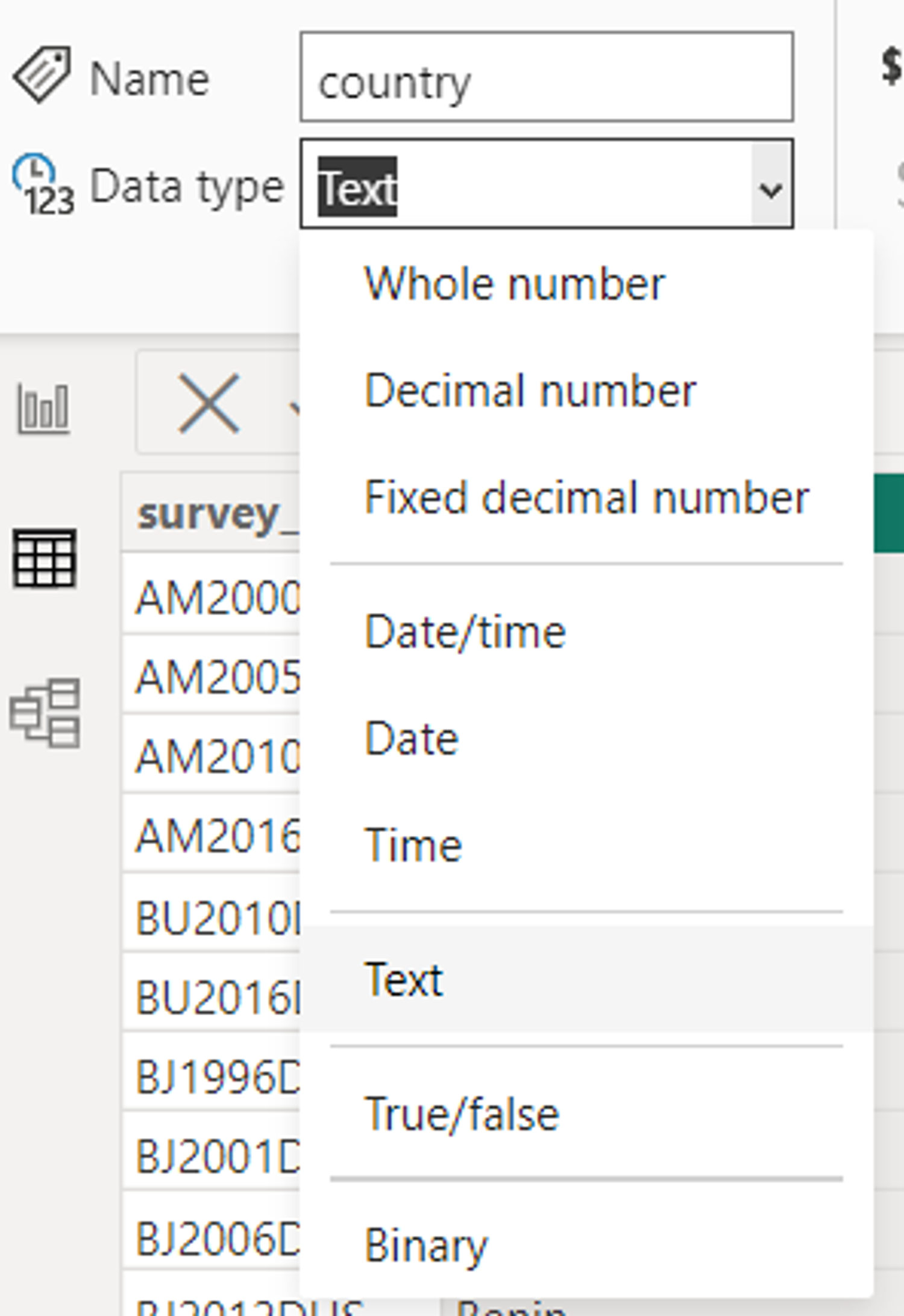
The column types as declared in Power BI in the first image here show that instead of saying double or int, it says Decimal and Whole number. We also have options for visualisation formats such as percentages or different datetime notations. It also has a binary type which is supported in the editor to enable conversion to friendlier types for the end user.

GoodData
While there is a wide range of data types supported in the GoodData pipeline, they are mostly semantic, so relating to their usage, not form. It takes all numeric type columns and sets them as facts, the date type columns and creates another table from them, and all text or character based columns and sets them as attributes. This also helps the tool in splitting the columns up into tables in a dimensional model - which will be discussed further in the inter-table relationships section.

Metabase
Interestingly, in Metabase, the data type is defined as it exists in the source, like an integer or string. But, the “field type” isn’t that straightforward; these are not int, float, varchar, or even percentage that we are used to when declaring dashboard columns, but types that are recognizable to any user. These are semantic types, rather than data types. For example, if a column contains numeric data, the categories available to select are Quantity, Price, Cost, Score, etc.
2. Data Dictionaries
In order for an end user to use data, they need to have data literacy. That is the ability to understand what the data they look at actually represents. To enable that, having a data dictionary is a first step. This includes column definitions and the ability to manipulate them, which can be a basic requirement for any dashboard creator.

Power BI
It allows users to edit column level properties on both its main dashboard and on the “Transform Data” window that shows up on the “Model View” tab. This allows you to select the data type of the column, to edit the name, format, and other sorting and aggregation functions you might want to apply to the column. However, this does not have the “data dictionary document” view that one might look for, as one has to click on each column to see its properties. In order to see the proper “data dictionary” document, it can be extracted through Power BI’s performance analyzer.
GoodData
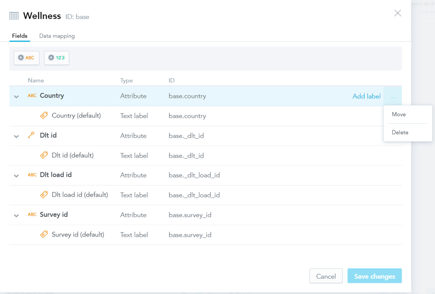
In GoodData Cloud, they increase the level of simplicity to read a data dictionary, and it has only a subset of options presented in the other two tools. The column level properties entail converting the field to a fact or label or moving the field to another table. It is the only tool here that shows the actual column name and mapping for each column in the logical model as it maps to the data source. This helps us understand which fact and label is matched to which database field in the source data, and how it was perceived under the naming convention in the source. This convention will be discussed more under table relationships.

Metabase
Metabase allows users to view the data dictionary for all tables in the admin panel. This includes setting column properties as well as field settings to be adopted into analytics flows. There are also other aspects to view and change column properties. The first is that after using the little book icon that says “Learn about this table”, we are taken to some documentation that would be available on what that table is (if it was filled in before). After which, we can click on the “Fields in this table” category and that is where the field type of columns can be updated. The second place one we can change the field type is in the metadata of “Questions” or “Models” created. These can be excerpts of data with particular elements of different tables in the selected database. Lastly, Metabase is also the only tool among all, that has the ability to add column level descriptions - that is an amazing level of documentation that one can have available.
3. Table Properties & Descriptions
For an analyst, navigating extensive databases within dashboards can be a challenging endeavor. Ideally, one should be able to discern the purpose of each table by its name alone. While this might be feasible for analysts who were involved in creating and configuring the database, it can be quite perplexing for newcomers to the organization. In such cases, comprehensive documentation becomes an invaluable resource, aiding them in their data exploration journey.

Power BI
All tools show table level descriptions in some shape or form. Power BI shows table descriptions right under the “Model View” tab, this can be used as a means for table level documentation.

GoodData
GoodData on the other hand shows it in the “Data” tab, under “More” > “View” details option on each table. This does not show a documentation level of description for each table as the other two tools. But includes the data source mapping as discussed in the column details section.
Metabase
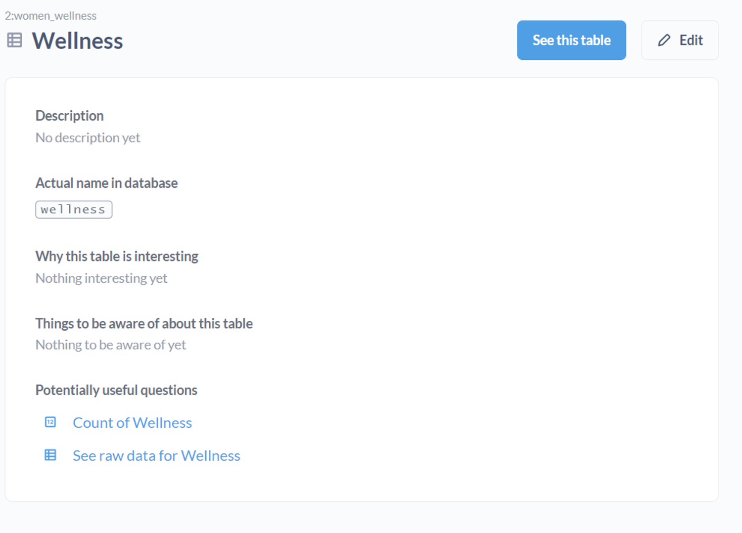
Metabase shows descriptions and ways to add them in the “Learn about this table” option on each table name, then takes it one step further and adds more information by asking “What makes this table interesting” and “Things to be aware of”.
4. Inter Table Relationships
In order to create metrics and visuals that involve data from multiple tables and/or datasets, each dashboarding tool needs to be able to detect or define relationships if they exist.

Power BI
Power BI has one of the most popular setups for data modelling, all contained within its Model View. It has the ability to both auto-detect relationships and the functionality to define them inside the tool in a very easy, drag and drop method. The cardinality for relationships is mostly detected itself even if the relationship is defined, but can also be edited.

GoodData
As for GoodData, the logical modelling layer is quite different than the other two. As discussed in the data types section, and shown in the image, the date type fields are taken and defined as separate tables (or datasets). The reason for doing so is in the spirit of creating a star schema; where one date table serves every table that requires a date dimension. GoodData takes into consideration the star and snowflake schemas as it splits all fields up into facts, labels, and attributes. GoodData requires that fields be named according to a particular convention in the source to be recognized as keys automatically. However, it is also possible to assign primary and foreign keys by drag and drop methods.
Metabase
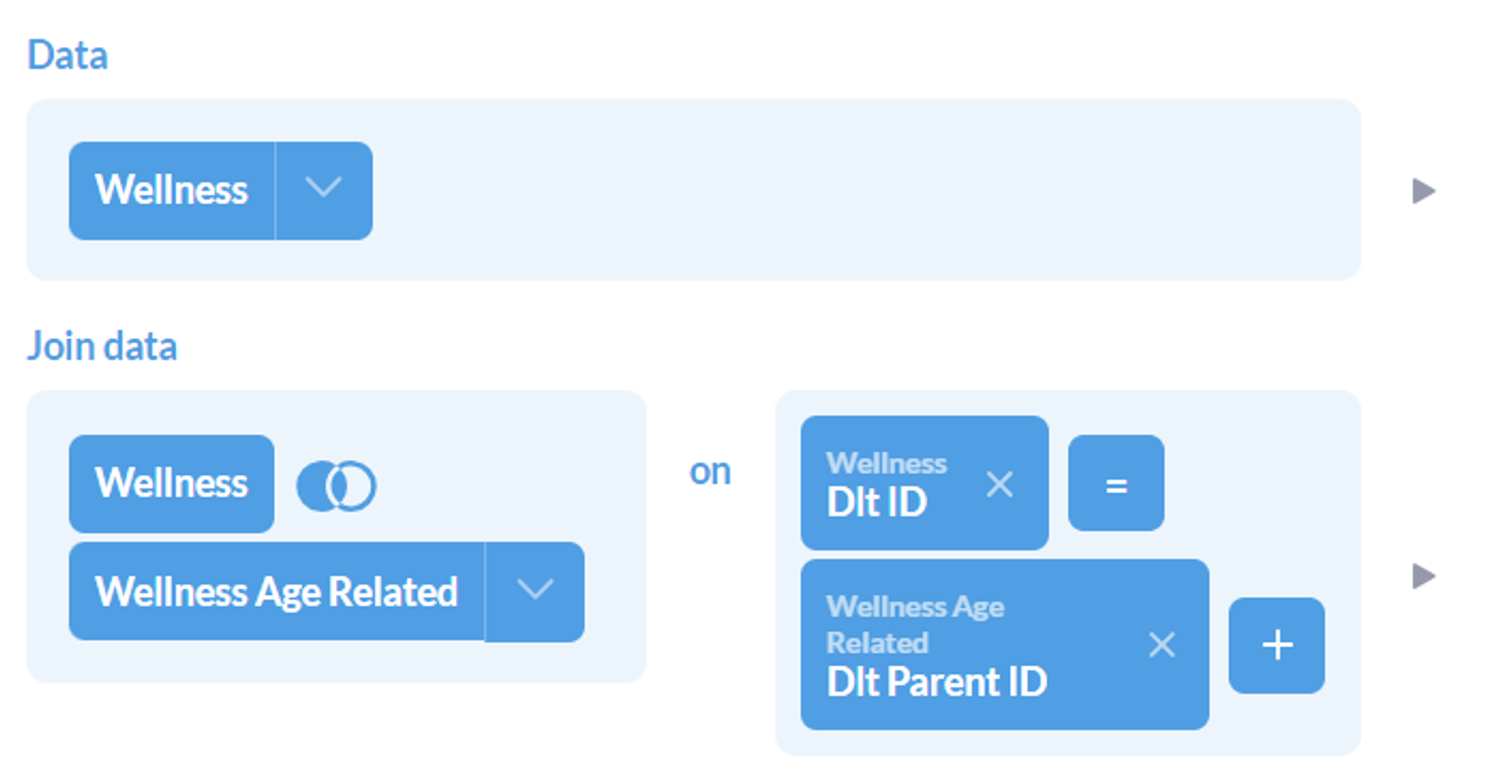
For Metabase, a primary or foreign key can be stated as such in the metadata (or field type display/settings) of a table. This can be either be done globally through the admin panel, through field settings in the data dictionary as discussed above, or per visual within Models and questions, through joins. Which means that in order to create a visual out of two or more connected tables, they need to be defined in some sort of SQL Query or Model (if not already connected in the global metadata). There is no ERD level view of table relationships as defined in GoodData and PowerBI.
5. Custom Query Language
When all drag and drop methodologies for defining metrics just aren’t cutting it anymore, one craves SQL and must resort to code. However, different dashboarding tools have different custom query languages.

Power BI
Power BI has two custom languages known to its developers. One of them is DAX - Data Analysis Expression, and the other is Power Query M - Microsoft Power Query. DAX helps to build formulas and easy-to-complex expressions for measures and fields. Power Query is a powerful import defining tool. This can include filtering through one data source while loading it, or combining multiple data sources to your own need. This sets itself apart from other custom query tools as it is helpful during data loading, as compared to metric creation for visuals.
GoodData
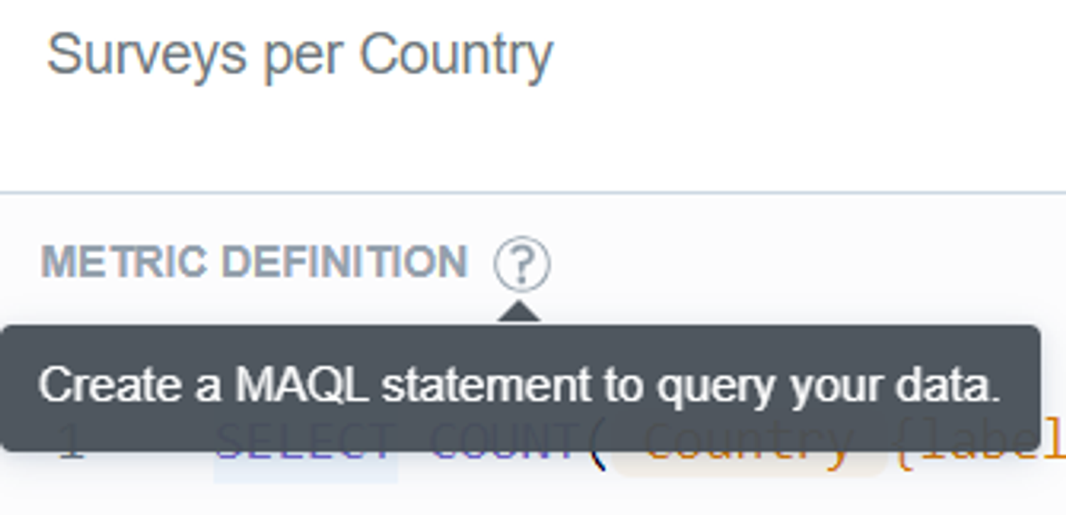
GoodData has its own query language called MAQL, or Multi Dimension Analytical Query Language. It is what is used to define metrics, expressions, functions, or other simple or statistical queries. It works on top of the logical data models defined, and hence is aware of the table relationships and dimensions. That is what sets is apart from SQL, which is for relational databases, while MAQL is designed to perform for multi-dimensional models. SQL can still be used to specify a SQL dataset in the scope of the logical data model. MAQL is then used on top of this stored query instead of a physical table.

Metabase
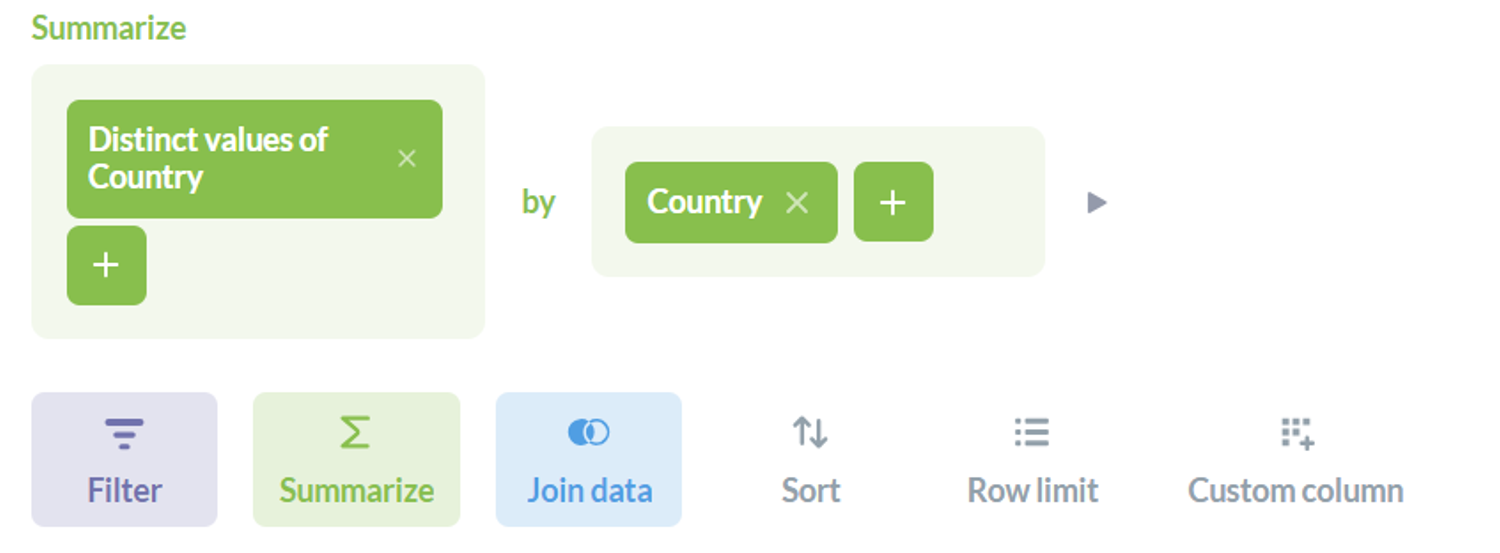
Metabase sticks to the basics and uses everything SQL! It uses SQL to define custom models and expressions. This includes both writing code to create aggregations and metrics, and the interactive SQL form that they have created. The non-code SQL allows users to do everything one can with SQL, with very well thought-out frontend capabilities. The interwovenness of SQL can be seen when code creates visualizations, and vice versa! Meaning, the aggregations created directly on visualizations can be converted into SQL code - as shown in the image.
6. Data granularity Management: Column Creation & Aggregation capabilities
In foundational database courses, we learn the importance of normalization and how great it is to keep the integrity of your data. However, as we go deeper into normalization levels, the data may become redundant and that is a problem for dashboarding tools, because the data becomes unnecessarily heavy to load. Different tools provide different methods to overcome this problem. That can either look like reducing data granularity, creating custom fields, or aggregating tables.

Power BI
Power BI introduces the ability the create custom fields and columns where you might be able to truncate redundant data; like the granularity of time into chunks. On top of that, another table can be built, aggregated on the granularity level you require. This can go beyond chunks of time, into categorizations of any nature, which is a great level of customization that is available in Power BI; the power to make custom calculated fields in the Transform Data section of the tool.

GoodData
GoodData allows you to switch each dataset from being mapped to a physical table to being defined by a custom SQL query. This feature enables you to add custom-calculated fields, filter out specific data, or even join multiple tables as needed. You can then map the fields to the results of that SQL query. Additionally, GoodData helps manage granularity for datetime fields directly by setting your own custom truncation to them. This can be done so easily by viewing the details on the datetime objects that are cast as a separate table/dataset by GoodData.
Metabase
The same methodology can be followed in Metabase. Where it is easily possible to create Models with your own defined level of aggregation, as well as custom fields that you can introduce to the tables. Custom Fields are created using Custom Expressions in Metabase - which can be done through the query builder.
7. Defining Local or Central Metrics
One of the main responsibilities of BI experts is to track metrics, align them with the company’s expectations, and flag them if they go over or under their expected magnitudes. This, according to some data professionals calls for centrally defined definitions that others can use and follow, rather than defining them on their own and possibly misleading analytics flows. The ability to predefine metrics, or aggregations in a dashboard are known as the key abilities of any dashboarding tool! Alongside the ability to simply define these metrics, let’s also explore the ability the define central definitions of metrics as well.

Power BI
In Power BI, these metrics are known as Measures, and can be created from both the fields pane and the calculations view on the Home tab. Either the options given on the Fields pane can be directly utilized to create a metric on a visual, or DAX can be used to create a reusable aggregation as another field under a table. Additionally, the Power BI service has a “Metrics Hub”, where users can create metrics and set the scope for which other users can use them.

GoodData
Involving its own query language, GoodData uses MAQL to create custom metrics that can be dragged onto the visuals in the “Analyze” tab easily. This functionality can be found under the Metrics tab, where all metrics can be created and managed. Since these metrics are saved, this can act as a central service to manage and use metrics too!

Metabase
In Metabase, the Summarize functionality serves the same function as aggregated metrics-creation. This can be found after you click on any table in a selected database. Furthermore, the functionality for the creation of custom metrics can be extended to an SQL query, Metabase Question, or Model. Additionally, in the Metabase admin panel, one can create centrally defined metrics as well. These can be adopted into reports that anyone can create, as long as granted the right access!
8. Data Refresh and Loading Capabilities
Whether a dashboard is being built for the first time or is fully furnished but needs to be periodically updated, data loading capabilities of dashboards must be carefully considered for successful reporting. All three tools have very clear methods to add data and support various sources including custom JSON and CSV loaders. How the data can be manipulated after that has been discussed in depth above. We lastly talk about updates.

Power BI
Coming data updates and refresh capabilities, it depend on how data was loaded onto Power BI. If the data has been imported, then the refresh button and scheduled refresh would work fine to update the dashboards. However, if the loading has been through DirectQuery or LiveConnect, then it does not make sense to add an additional refresh functionality as it does not apply. What does end up being needed is cache availability. Which is provided on Premium offers of the product.

GoodData
GoodData also has a clear refresh button and methodology to refresh sources in the tool. But, unlike Power BI, GoodData refreshes it’s cache as opposed to the entire database. The tool stores computed results and data used in visuals and dashboards in an internal cache. If data is to be refreshed, the cache needs to be refreshed. In this process, it is recommended by GoodData that an automated notification process be set up to clear up the cache from the old data and load into the new one.
Metabase
As established above, data need only be refreshed if it is stored. Metabase establishes a direct connection to the source, so it doesn’t need a refresh option. Unless the data is a file based import, then Metabase recommends that it be used for ad hoc analysis. As for periodic database syncing, one should rather connect their dashboards to a hosted database. To manage overly frequent refreshes and its impact on dashboards, Metabase offers a Result cache for dashboard charts and a Model cache for modelled data.